PRNTRS
Bringing a stalled project to production.
- Role
- Software Engineer
- Year
- 2026
- Scope
- Performance, Security, Testing, Interaction design
- Live
- prntrs.co ↗
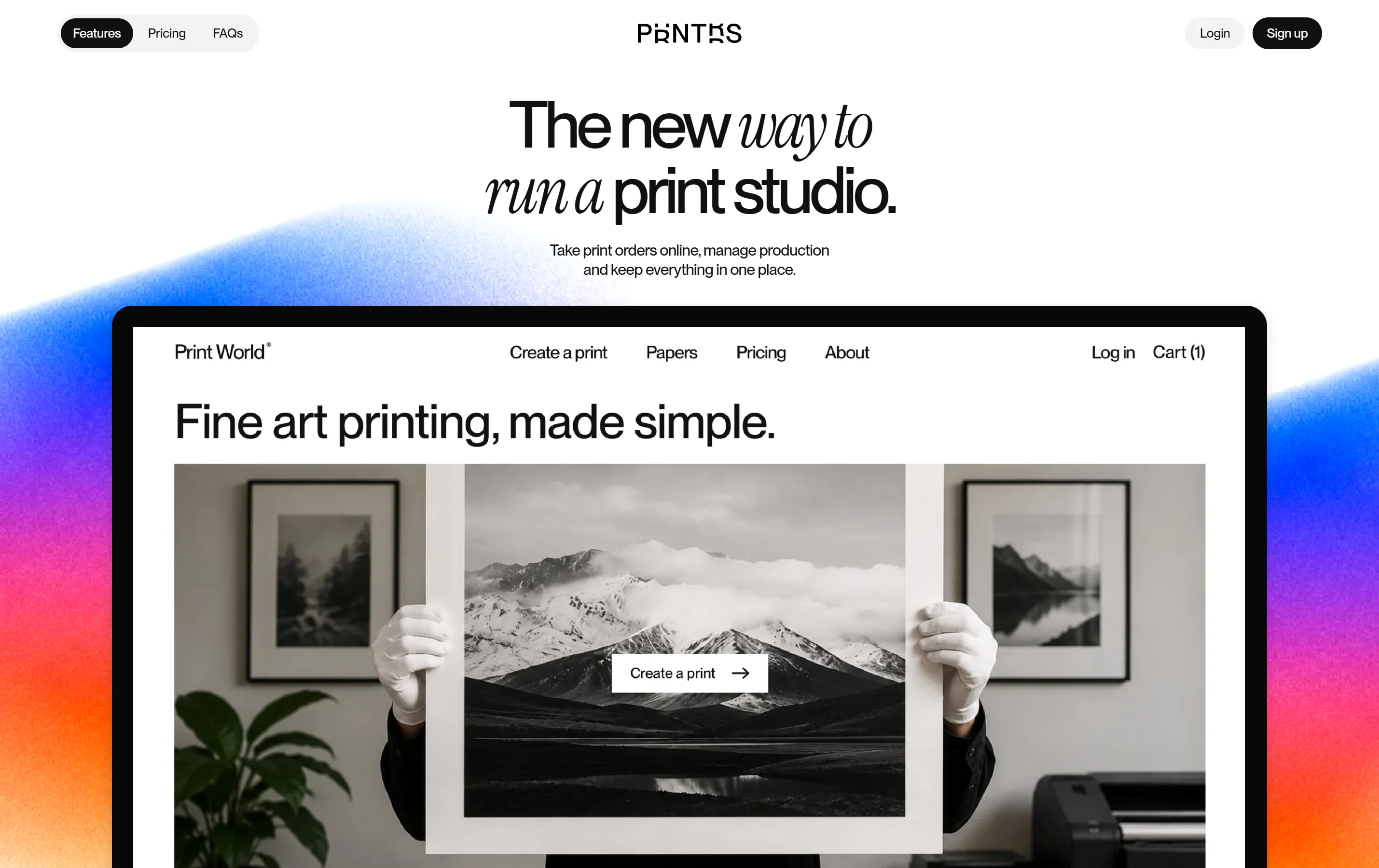
My role
When I joined PRNTRS in July 2026 it had stalled. I worked with the team to find the best route forward, and to decide which features would make it ready for studios to pay for.
After a push on development, building team accounts and an activity log, plans and billing, a product shop and storefront themes, my focus moved to security testing and improving the experience across the whole product.
- Team accounts and activity log
- Security testing
- UX and motion
- Performance
- Testing
- Billing and plans
- Storefront themes
The product
PRNTRS lets independent print studios take orders online under their own name: a branded storefront for their customers, and a back office for the studio.
Team accounts
Built for a team.
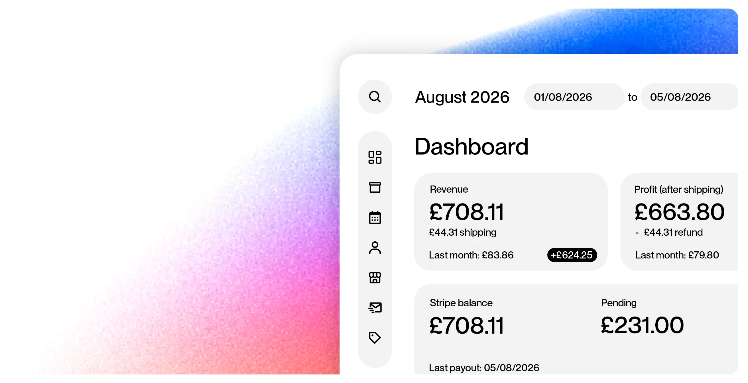
I built team accounts, the part of PRNTRS I’m proudest of. An owner invites their staff and gives each a role, and every permission is checked on the server, not just hidden on screen.
Alongside it I built the activity log, which records who did what across orders, money and data exports, so an owner can always see what changed and who changed it.
I also gave orders search and paging on the server, and job tickets and packing slips in each studio’s own branding.
Print engine
Prints that match the file.
I fixed the print engine behind the creator: phone photos printed sideways, photos from higher-end cameras printed with a colour shift, and artwork it couldn’t print slipped through. It now turns those files away at upload instead.
Each fix went in behind a test that pinned the old behaviour first, so the change was deliberate and nothing else moved with it.
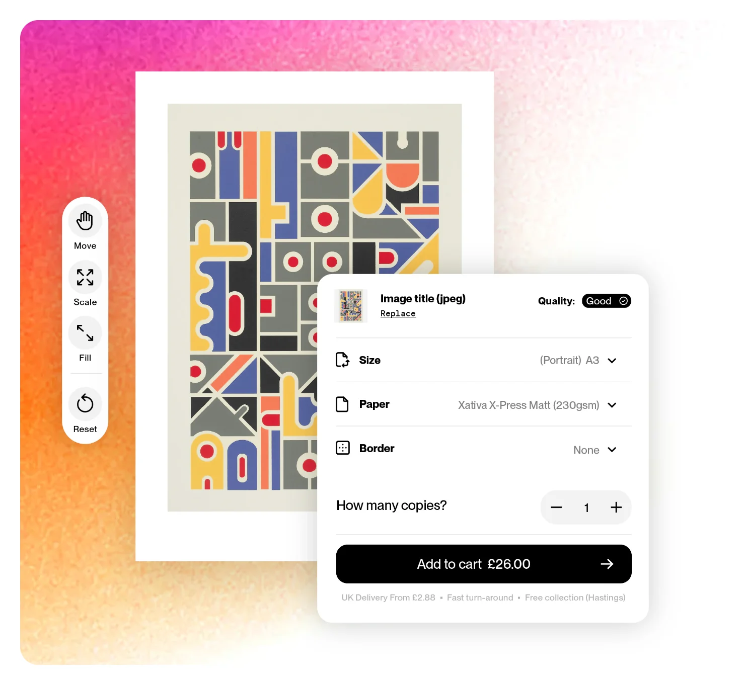
Making it feel right.
Motion that explains
I brought smooth, restrained motion to the homepage, the dashboard and the storefronts, only where it explains a change: panels ease open, selections glide between options, figures ease to new values, and new orders slide in. Reduced motion turns it all off.
Loading without the jumps
Spinners and “Loading…” text became placeholders shaped like the content on its way, tinted to each store’s own colours, so pages settle in rather than snap into place.
Themes that hold any colour
I built storefront themes from a mix of my own designs and supplied prototypes, then made each one hold up under whatever colours a studio picks for it.
The small things
Phone menus, the Store Editor and FAQ answers ease open and shut, the Creator’s sheet glides to a new size, and the homepage bar slides away as you read and returns when you scroll back.
Making it fast and safe.
- First download, after splitting the app
- 680 → 96 KB
- Worst layout shift on a storefront page
- 0.49 → 0.002
- Tests in the suite I set up, run on every change
- 0 → 1,400+
A safety net first
There were no automated tests when I joined. I set the suite up in my first week with 89, around money, plan access and the walls between studios, running on every change. It now runs over 1,400 tests.
A security test pass
I ran a security test pass across the platform, probing nine suspected issues around access between studios and within teams. I fixed the ones that proved real, each with a test so it stays fixed.
A smaller first load
Every visitor downloaded the whole app, dashboard and all four themes, in one 2.4 MB script. I split it so each page loads only what it needs, and the first download fell from 680 KB to 96 KB.
Pages that hold still
Storefront pages jumped as their content arrived. I changed how each page and its data load together, and the worst layout-shift score went from 0.49 to 0.002.
Lighter images and fonts
The homepage loaded about 7 MB of images, one of them a 3.3 MB gradient. Re-encoded, the whole site’s images now come to about 2 MB, and the brand font dropped from 120 KB files to 56 KB.
Bigger stores, same speed
The customer list loaded every order a store had ever taken, in full. It now pages on the server, 50 at a time, with tests proving the totals come out identical.
See it running.
PRNTRS is live, and every change to it now runs against the tests first.